Bioinformatics analyses often consists in looking for interesting signals in large amounts of data. But in my current work environment (Darwin scripts with occasional gnuplot and R plots), I find it both conceptually difficult and practically tedious to produce insightful visual representation of my data. There are large scientific benefits in finding new visual representation of bioinformatics data, and in simplifying the process of data exploration in general.
This is not to say that there are no such examples. In fact, some excellent representation exist, and tools to easily produce them have been developed. I am listing a few of them on top of my head here as inspiration and starting point for future ideas:
Sequence logo
Sequence logos, introduced in 1990 by Schneider and Stephens, are very clever way of displaying consensus sequences. To take a classical example, the promoter sequence of many eukaryotic genes contain a TATA-box, the perhaps best known transcription factor recognition site:
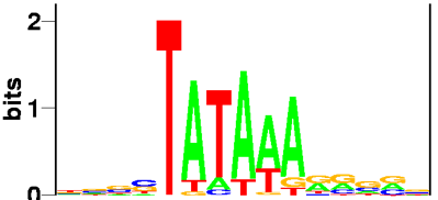
The height of a character depicts its degree of conservation in bits of information. This metric make sense because it is related to the thermodynamic energy. More importantly perhaps from the visual point of view, the logarithmic nature of bits makes strongly conserved characters stick much higher than they would if their height was proportional to the probability. As a result, the figure resolutely concentrates on signal, and wastes no space on noise!
Circular Phylogenetic Trees
Visualizing phylogetic tree of life using traditional representations becomes difficult for more than about 100 leaves. The circular tree representation has been popularized by iTol from Letunic and Bork:

(source: Wikipedia)
The downside of this representation is that since all leaves are distributed at constant angular intervals, closely related leaves can be far apart, while distant leaves can be adjacent. This problem is partly mitigated by changes in label color, but this can only be effective for the top few levels.
Circos - Genome visualization
The following page shows stunning genome visualization, also based on the idea of a circular representation.
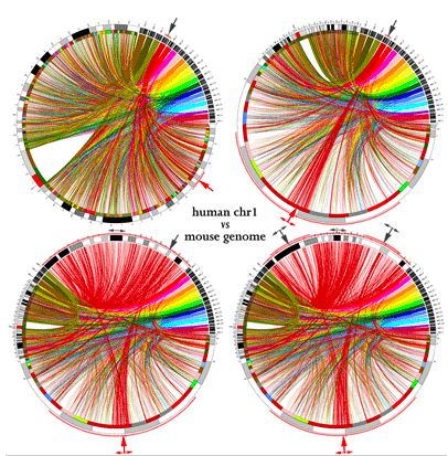
Circos: visualizing the genome, among other things
Be sure to have a look at their poster too...
Visual Complexity
The Visual Complexity page is a repertoire of complex representations of networks, and include a number of examples from biology:
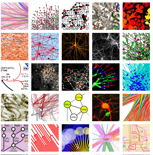
(source: http://www.visualcomplexity.com/vc/)
References
T. D. Schneider and R. M. Stephens, Sequence Logos: A New Way to Display Consensus Sequences (1990) Nucl. Acids Res. 18: 6097-6100,